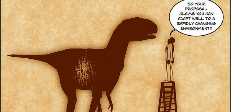
Lean ensures we’re building the right product and Agile helps ensure we build the product right. As the blog post Lean vs. Agile UX explains, Lean focuses more on product strategy while Agile focuses on product design processes.
Blog
All
Jedi Principles of UI Animation
Why, when, and how to use animation in your UI, what UX Choreography is, and what all of this has to do with Star Wars. I used be a print designer, then web designer, then UI designer. Now I’m becoming a UX choreographer — great title to put on a resume.
12 Tools For UX Design Newbies
It can be intimidating to get into user experience, especially if you’re a newbie who isn’t quite sure what to do at first. Fear not, these 12 tools will help you get to speed in no time. Even if you’re not a newbie, we’re betting that you can still use these tools to get better at what you’re doing!
Adobe’s Project Comet: What to Expect from the 2016 Public Beta
Andrew Shorten is the Director of Project Management at Adobe and part of the Project Comet team. Comet is the codename for Adobe’s new UX/wireframing program meant to provide real UI design tools and offer an alternative to Sketch.
User Stories and Scenarios in UX Design
There was a time when the best website design was the one packed up with some cool new features, a weird navigation and anything else that the designer thought looked good. We trusted the designer’s taste and opinion often even more than our logic.
How To Simplify Designs For Smart Users
Simplicity. Throwing too many elements at your readers at once is a good way to drive them into information overload. Too much at once does nothing to help the viewer interact with a webpage, and it may send them scrambling for the back button.
Interface Animation. The Force of Motion
Even in the ancient times people knew about the great power of motion. Literature, art, folklore, technologies all witness numerous attempts of people to explain motion as one of the brightest features of life.
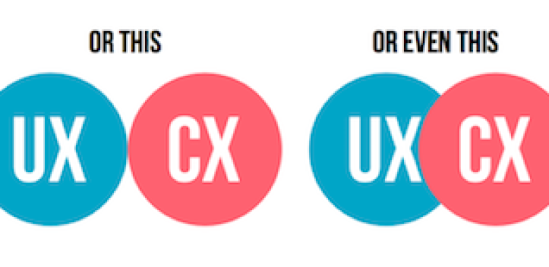
UX vs CX: Which is more important?
You’ve probably heard the terms UX and CX, and how they’re the key to your company’s success. Many still aren’t clear, however about what the difference is between the two concepts. Perhaps you’re under the impression that only one of them is worth investing in, or that they’re both the same thing.
Turning Stubborn Stakeholders Into UX Allies in 3 Easy Steps
Great design is a collaboration. Great products are created when a team comes together, identifies and embraces a true problem or opportunity, and then allows each member to execute based on their specific expertise.
Usability lessons to Improve Self-Service
Josie shook the television remote furiously—her digital recording device was refusing to record the upcoming episode of The Great British Bake Off. Frustrated, she opened up her laptop and searched the help site for the recorder.
Understanding Your App : How Task-Based Testing Can Enhance the User Experience
The use of mobile apps has risen sharply in recent years, and so too has their importance to many businesses and organizations. Driven by the prevalence of smart phones, tablets and mobile internet connections, recent data revealed that since 2008, 100 billion apps have been downloaded from Apple’s App Store alone.
Making A Case For The Desktop Hamburger Menu
A big part of being a UX designer is knowing how and when to use web elements appropriately. Offering shortcuts and streamlining a user experience can be incredibly satisfying, especially when it also simplifies the overall look and feel of a web page.
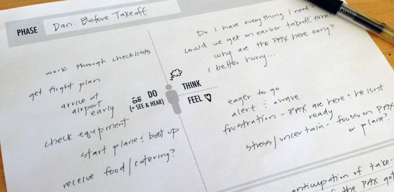
The Practical Guide to Empathy Maps: 10-Minute User Personas
UX designers know better than anyone — it’s what’s inside that counts. As in, the user’s thoughts and feelings, and how those affect what they say and do. That’s where the empathy map comes in.
Remote User Research & Usability Methods
When remote study works
Remote user research has two key advantages over traditional testing:
- Flexibility. The remote method allows you to connect with…
By Anna Iurchenko via UX Magazine
7 Methods for Discovering Usability Problems
Finding and fixing usability problems in an interface leads to a better user experience. We often think of usability testing as the only method for evaluating the usability of a website or application. There are, however, other methods that can help uncover usability problems. These methods can be broken down into empirical (usability testing, surveys, and analytics) or inspection methods (expert review, heuristic evaluation, cognitive walkthrough, and guideline review). Each has their pros and cons but all can be a part of an organization’s approach for uncovering problems and creating a better user experience.
Content overlap

There is content in the product overlapping with other content.
Possible solution(s)- If it supports the user or goals, keep it!
- If it does not support the user, remove the overlap.
- Design a central point of access to the content.
Happy Holidays!

Mockaroo!
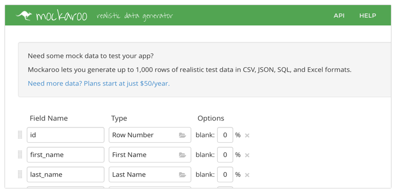
Need some mock data for your concept, sketch, design, website, idea or testcase? Get it from mockaroo!
Mockaroo lets you generate up to 1,000 rows of realistic test data in CSV, JSON, SQL, and Excel formats, for free!
Navigation to deep

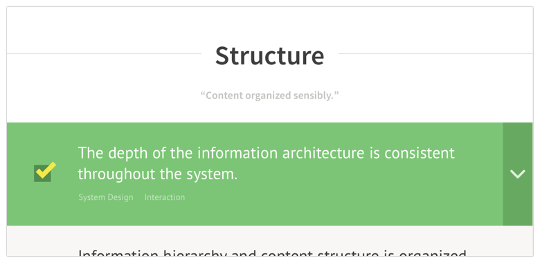
The depth of the navigation structure and information architecture is to deep and / or inconsequent.
Possible solution(s)- Use a fixed number of levels for structure.
- Design architecture based on priority of content.
- Scenarios, Scenarios, Scenarios.
